What is BigCommerce?
Before we dive into the web accessibility of BigCommerce, I want to share their extraordinary founding story. BigCommerce provides a platform for business owners to sell their products and services on the internet. The multi-million dollar e-commerce platform is a real success story. Its co-founders Eddie Machaalani and Mitchell Harper, two Sydneysiders, started a business together in 2003 after meeting on an online chat group for content management system builders. Their first company was created products to assist businesses in the development of websites and intranets.
The start of BigCommerce
They started their company BigCommerce in Sydney in 2009, with starting money $10,000 that they got from their previous business. Their aim was to make it easier for small businesses to sell online. Three requirements were central to their mission: it had to be reasonably priced, simple to use without technical skills, and enough features so that a small businesses would not feel they were missing out on functionality.
At the time, eCommerce accounted for less than 6% of overall retail revenues in the United States, but Eddie and Mitchell saw a massive opportunity for small companies to thrive if they had access to an easy-to-use, low-cost eCommerce platform. The BigCommerce network, clients, and ecosystem have evolved together over time. Their customers told them what they missed and needed on the platform to compete. All the feedback they received led to creative product changes. It is not for nothing that their company value is ‘Customers First.’ The first project they worked on was software that made designing web pages easy. They set the price at $149, and after a year, they had made a million dollars by selling an +/- 20 copies per day. BigCommerce, the company’s flagship product, has grown and has a $112.1 million in revenue today. An eCommerce platform that drives 10,000 online stores.
BigCommerce goes to NASDAQ
This tech success story, BigCommerce, has debuted on the NASDAQ, impressing the market with a gain of more than 200 percent on its first day of trading on Wall Street. According to The Sydney Morning Herald, nine million shares in the e-commerce platform were priced at US$24 each in an initial public offering that valued the firm at US$6.5 million ($9 million). The shares closed at US$72.27 at the end of the company’s first day of trading, having hit as much as US$91.80 earlier in the day.
There are about 60,000 businesses on BigCommerce with several tools to achieve their business goals. Without a doubt, the 200 plus add-ons on BigCommerce are of high importance to your business. However, if your store is not accessible to potential buyers, you may not get any value for your investment. Stay tuned as we discuss solutions for making your BigCommerce store accessible.
What values does BigCommerce offer?
BigCommerce’s value proposition is lucid: an easy-to-build well-functioning website that you can put up and manage with little or no technical know-how. Like other SaaS (software-as-a-service) companies such as Shopify, Duda, Drupal, etc., BigCommerce allows users to set up their internet stores without undergoing the rigors of creating a regular website. It does this by providing clients with customizable templates that they can use to easily create an attractive online store.
For people with knowledge of coding or looking to hire a professional web designer, there is a full HTML editor to edit the framework as you desire. There is no barrier to selling your products on BigCommerce.
To make it easy for businesses to get their brands online, BigCommerce provides everything businesses need to thrive online. First, BigCommerce hosts its server, so clients do not have to register for or purchase a hosting solution when they host their brand on its platform. Besides, the e-commerce company provides hundreds of add-ons across several categories with tens of integrated payment gateways. With BigCommerce, e-commerce couldn’t have gotten easier.
Five accessibility issues that could affect your BigCommerce store
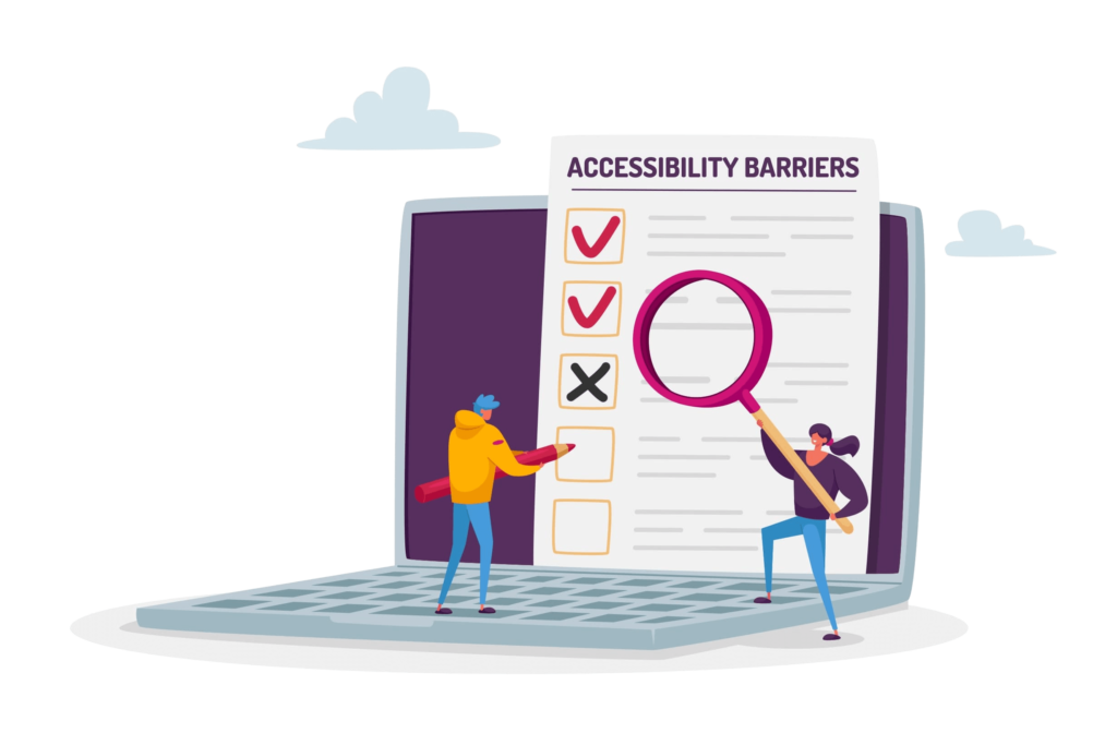
It is unusual to find businesses on third-party platforms, such as BigCommerce, on the accessibility lawsuit diaries. That notwithstanding, like every website out there, your personalized e-commerce store could be vulnerable to several compliance problems. Not being served a demand letter is an open win; however, you may be losing many customers due to an insensitive website design. You could be getting accessibility wrong in several ways. The five popular ones include:
- Disorganized content structure, which is difficult to read by screen readers
- Not using alternative description for non-text content
- Using too much or too little contrast
- Inaccessible order form, especially by assistive technology
- Poor content font and size
Three general accessibility tips for your BigCommerce website
Although BigCommerce guarantees to host your business website without exerting much effort, it does not promise you automatic website accessibility. Making your BigCommerce site ADA compliant and accessible to all is a personal effort you must assume by yourself or delegate to a third party. With that said, there are many ways to get your website in shape and accessible to all. Generally, there are two ways to go to website compliance: manual accessibility or the automated solution.
If you would like to get your hands dirty with your BigCommerce site compliance, there is a long list of steps to take to achieve your goal. The following three tips are highly recommended benchmarks you can work with for your needs:
1. Design accessibility into your customized storefront theme
As a merchant on BigCommerce, you are at liberty to select from a host of ready-made stencil themes for your storefront. By default, each template is fully responsive and optimized for mobile and web browsers. Since BigCommerce engineers built these themes following industry standards, you may not require too much attention when considering accessibility.
However, in a situation where you decide not to select any of the existing templates, you can tailor your online store to reflect your brand using the page builder. Here, you have to be very careful not to build a wall of inaccessibility against disabled people through your design.
When customizing your store theme, remember to select the right color and text font, and size. Using the right amount of contrast, you can retain more customers on your site or chase them off if your contrast is too high or low. People with low vision or color blindness may especially be affected by contrast inadequacy. The WCAG standard for color contrast remains 4.5.1 for level AA of accessibility.
Per your website font, this is also crucial to your website being accessible. Using fonts that require users to strain their eyes is a bad practice. Instead, choose a bold, legible font of at least 14 or 18 points to enhance readability. Since bigger fonts are easier to read, you may cut down on your contrast to 3:1 ratio when using 14 or 18 font sizes.
2. Include alternative texts for every product
In keeping with the spirit of accessibility compliance, the first piece of advice from BigCommerce itself to clients is to employ alternative texts. This alt text is what end-users rely on assistive tools to surf the web feed on, especially the visually impaired. Interestingly, including a description improves product searchability. Product visibility, in turn, boosts sales and profit.
So, how do you attach alternative descriptions to your products on your BigCommerce site? Quite simple. A beautiful product photo increases buyers’ interest. For that reason, BigCommerce advises users to add attractive images of the product they are marketing. You should upload more than one photo for every product so that you can fully present the product to potential buyers. Having uploaded all relevant images (either from your computer’s local storage or the internet), you must select one to represent the product from the images you have just uploaded.
Then click “Use as thumbnail” to pick the specific image you want visitors to see when they come across the commodity. Good practice in online sales is to include a product description that introduces your product to potential buyers. To save you the stress, BigCommerce converts this product description into an alternative text and, at the same time, the image’s alt tag.
3. Ensure the order form is easy to fill
You lose a lot of money if customers cannot easily complete orders in your store. Yet, forms are among the biggest frustration for people with disabilities, especially those relying on assistive technologies. So, how do you optimize forms on BigCommerce for accessibility?
- Pay special attention to each of the five components of a typical form: structure, input fields, labels, call-to-action, and feedback. Each form, either for information or checkout, must be well-structured. Input fields should be wide enough, and each field should include a label.
- Rethink using (fully) custom drop-downs. A survey shows that 31% of custom drop-downs pose critical usability challenges. Meanwhile, custom forms are expensive to build. It is bad business if a functionality turns off prospects despite the high cost of building.
- Consider native drop-downs, which are easier to interact with. We advise that you use them, except you must go beyond it.
- If you must use custom drop-downs, ensure that users can navigate it with a tab.
- Finally, adopt a “Shell Approach” for your drop-downs if you cannot keep to the native drop-downs and do not want to risk custom alternatives. The shell approach means that you design your form to display as a custom UI but serves the native drop-down when users interact.
UserWay accessibility for your BigCommerce website
Among the top web accessibility solutions we know, UserWay is an industry leader. UserWay provides a hybrid approach to accessibility for all websites, including BigCommerce websites. If you are considering a perfect solution for your BigCommerce storefront, you should think of UserWay.
For one, UserWay’s accessibility is free. You do not have to pay a dime to enjoy the accessibility widget on your website.
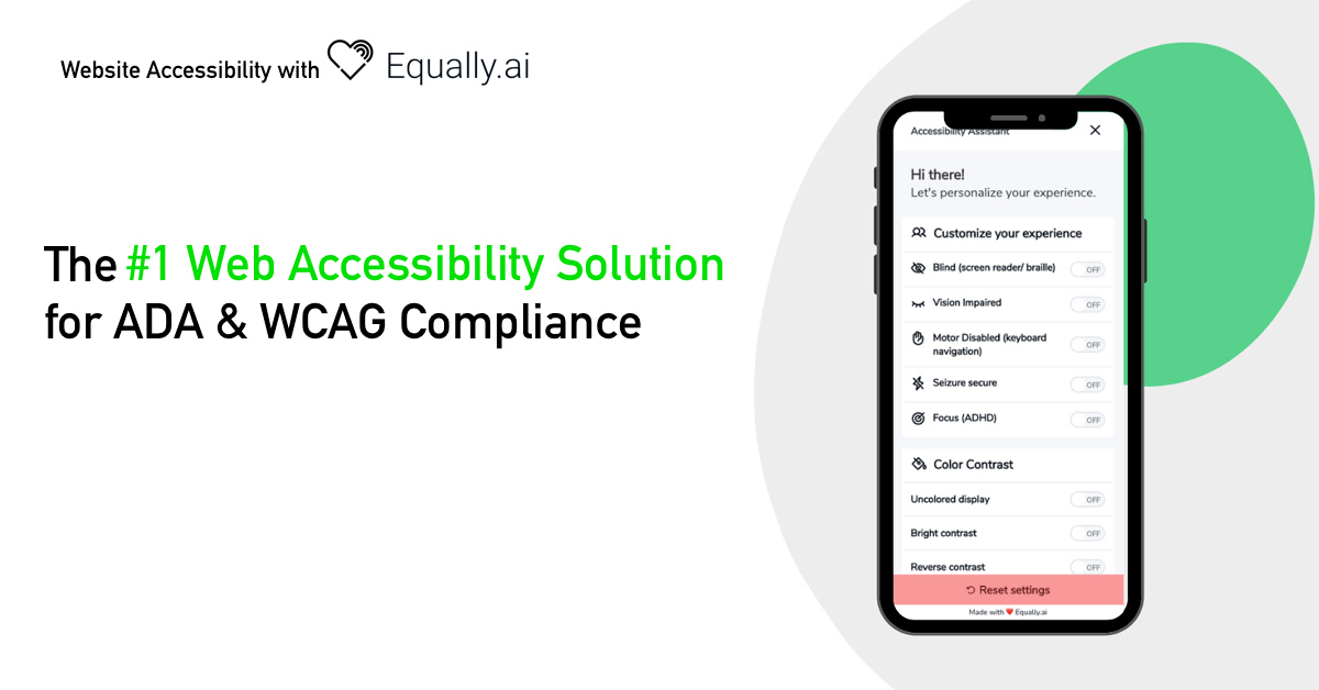
Second, the tool is easy to deploy and does not require any deep knowledge of programming. To get started, all you need to do is install a single line of code following a clear instruction present on the UserWay website. As soon as you complete the installation process, a widget pops up on your site. This tool is what end users will use to tailor your site to their peculiar needs.
Conclusion
Designing your BigCommerce storefront is important to your sales prospect and brand imagery. In doing that, however, you should be careful not to undo your business. Selecting theme features arbitrarily without giving thought to accessibility might alienate customers from your BigCommerce store. For this reason, you must check all important elements before pressing launch after your template customization. No matter what you do, you may not be able to guarantee 100% accessibility. This is why you should reinforce your effort with any of the accessibility solutions out there. We recommend checking out UserWay for its friendly and affordable features.


